Tuesday, June 9, 2015

Final Exam

4. My transformative photo:

This photo transformed how I viewed photography because I learned how to use negative space to actually create space. In this sense, what isn't shown in the photograph (all that space between the branches) is actually what makes the tree appear more geometric and appealing (to me at least).


5. The difference between shape and form is that shape is two-dimensional and formed with a closed line, and form is a three-dimensional shape.

6. The difference between pattern and repetition is that pattern is the occurrence of an object or symbol throughout the photo, whereas repetition is a pattern appearing again and again within a photo.


7. Movement is how the viewer's eye moves from place to place within a photo.


In this photo, the viewer's attention is first drawn to the red "No Smoking" sign, and then to the "Maximum Capacity" sign, and then to the two paintings on either side of the signs.

8. Of my last three projects, I think my Presentation Project (link here) is the best. 

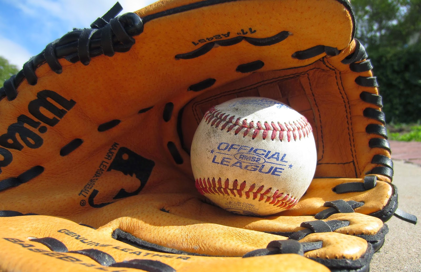
This photo is my best work because I learned how to position the baseball to fit the best angle for the lighting. Background and rule of thirds are also seen in this photo because the baseball is slightly off center and the background is simple and out of focus, drawing more attention to the baseball itself. Throughout my project, I also used my three rules of composition (rule of thirds, leading lines, and background) shallow depth of field to focus on the baseballs and not the backgrounds. In my photos, the baseballs are located on one of the gridlines of the rule of thirds, and I also used a black background to focus on the ball and hand. The lines of the glove and of Briant and Tommy's arms also draw focus to the baseballs.
This project changed me because I learned to use light and shadows differently to my advantage when I took photos, and I became more versed in. I learned to see differently by experimenting with many different camera angles as well as variously positioning the ball to focus the natural light on separate places on the ball. Through trial and error, I was able to find the light and shadows that I thought most complemented the baseball and made my photos the best.

Tuesday, June 2, 2015

Final Project Proposal

For my final project, I would like to do a series of pictures on plants and flowers. My mom has a lot of plants at home, and there is also a diverse range of flowers on campus. For all my pictures, I plan on using natural light and to focus mainly on the interior of the flower. When I take a picture of an entire flower, I'll use shallow depth of field to focus on the flower and leave the background blurry.

Examples that I can emulate are Stephen Studd's flower and plant photography portfolio (located here)

3 Rules of Composition:

  1. Rule of Thirds
  2. Leading Lines
  3. Background

Monday, June 1, 2015

Student Website Reviews

First Period:

Sam Sze's Weebly

I love the picture of the origami tetrahedron, and how Sam used a shallow depth of field to focus on the closest edge of the tetrahedron. Also, the lines are very sharp and appealing to the eye. The geometric shape and background are neat and simple; there's just something about a pyramidal shape that I think people are attracted to.

Third Period:

Kevan Mathis' Weebly

I think his best photo is the one of the green, spade-shaped leaf. The detail in the leaf is amazing; you can see almost every individual vein. It also uses depth of field effectively to focus entire on one leaf and make it appear very sharply.

Fourth Period:

Haroon Rasheed's Weebly

I love Haroon's picture of the silhouette in the hallway. The lighting makes the picture seem very peaceful, and the leading line of lockers draws attention to the subject of the photo. It also uses rule of thirds very effectively.

Monday, May 18, 2015

Presentation Project Proposal

The theme of my project will be baseball, focusing mostly on the baseballs themselves.

Example 1: For this photo, I'll use artificial light and a dark background to focus on the hand and the ball. I'll also add a black and white filter.

Example 2: For this photo, I'll use natural light and focus on the seams on the bottom of the baseball on the dirt.

Example 3: For this photo, I'll use natural light to illuminate a bucket of balls.

Example 4: For this photo, I'll use natural light to focus on the logo of the baseball and add a black and white filter.

Example 5: For this photo, I'll use natural light to focus on the glove.

I can provide all the props by using my own baseballs and glove.

Friday, May 8, 2015

First Commercial Shoot


Taken by me (11x17)


Taken by me

Taken by Tommy


Taken by Briant


Taken by Briant


Inspiration: Jennifer Rocholl's fashion photography

Wednesday, April 29, 2015

Photo 4/28/15

Unedited:


Edited in Camera Raw:

Cropped, -0.60 exposure, -40 shadows

Photoshop:


Tuesday, April 21, 2015

Photo Story MC Week

My friend Bill starting his car to drive us out to lunch.


We got out too late and had to wait in a line in the parking lot.

Finally got our food; Bill can't wait to dig in.


Spicy Chicken Deluxe Sandwich (so much better than school food!)


Good bye Chick-fil-A :(

Thursday, April 16, 2015

Story with a Photo - Chick fil A Cows


I took this photo when I went to Chick-fil-A during lunch on Tuesday, since my MC Week story is going out during lunch and taking advantage of the 32 extra minutes. I thought this photo was really funny because the cow is standing up with a weird look on its face and I know Chick-fil-A's advertisements often use cows telling people to "eat mor chikin."

Wednesday, April 15, 2015

MSJ MC Week Story

MC Week is great and all for celebrating the various cultures present at MSJ, but let's not overlook the biggest benefit to upperclassmen: the 1 hour, 8 minute lunch period. Compared to lunch's usual 36 minute interval, lunch during MC Week is the opportune time to venture out to previously unreachable lunch destinations and still have time to eat. For example, Monday I went to In-n-Out, and yesterday I went to Chik Fil A. Say what you want about my "lack of support for our school's clubs and traditions," but a majority of seniors (and a large contingent of other classes I'm sure of as well) don't even eat MC Week food, either because of their sky-high prices or, like me, they crave the opportunity to actually enjoy eating out instead of rushing to and back to school. The new ticket system is also an unnecessarily circumvented method to pay for food to prevent possible embezzlement from clubs and/or individuals. Honestly, seniors going out for lunch is just as big of a story as everyone else staying at school to buy overpriced, under-portioned food. True, the previous three years, I hailed MC Week for the variety of food compared to the prison-quality cafeteria food and for shortened classes and longer lunch, but the real highlight, if any, of MC week is the assembly we have on Friday. Everything really builds up to that. But as I have already survived 3 MC Weeks at MSJ, here is the accurate story of MC Week for most seniors as well as for me: a fifteen to twenty minute drive out to a restaurant, having the time to dine in and enjoy the food, and the car drive back to campus. All because of those extra 32 minutes.


Thursday, April 2, 2015

Shutter Speed and Everything After

My partner is William Shih.

Lens Blog Photo #6

  1. Fast shutter speed because it freezes the motion of the trucks and they are all in focus.
  2. There are leading lines in this photo: the white traffic line and the middle divider both emphasize and lead to the fallen truck.
    The rule of thirds is also shown because the trucks are located on the gridlines and not directly centered in the photo.
  3. One element of art is color because the truck closest on the right is red and blue, and the truck further down on the right is bright green.
  4. Proportion is one principle of design used. The green truck is much further away, so it appears smaller than the blue truck. Similarly, the word "TRANSPORT" on the blue side of the truck appears larger than the "VEENSTRA" letters.


Tuesday with Farley's kids:

The shutter speed is 1/610 second.

Friday, March 27, 2015

Principles of Design - Unity


Edits: -100 Highlights, +15 Shadows,
Unity is a feeling of completeness in a photo in that all aspects seem to work together. In my picture, I used pattern, repetition, balance, and proportion to create the sense of unity between all the bushes. You can also see pathways in the dirt between the bushes, which I think adds to the completeness of the photo because everything is connected.

Documenting the Blues in the Mississippi Delta photo

In the Lens blog post titled "Documenting the Blues in the Mississippi Delta," my group chose photo #6 as the one showing the most unity. There is a lot of pattern and repetition with the humongous pots as well as the trash in the background. Proportion is also used because although the pots are lined up together, they have a variety of sizes based generally on their proximity to the photography. The fire and the bubbles in the pots also add emphasis because after seeing it I was interested in what the man was barbecuing. Together, all these principles of design form unity throughout the picture; it feels very complete and satisfying how movement is utilized.

Thursday, March 26, 2015

Principles of Design - Variety


Edits: +0.35 Exposure, -24 highlights, +13 shadows

Variety is how the photographer uses multiple principles of design to capture the viewer's attention and enhance movement of the photo. In this photo I showed balance with the symmetry of the wheels as well as pattern with the shape of the wheel and tire. The green circle with the arrow pointing left also adds emphasis. The movement in this photo is from the tires to the "Car West" sign to the bridge on the vehicle and then the smashed car inside.

Wednesday, March 25, 2015

Principles of Design - Rhythm


Edits: -0.25 Exposure, +25 Contrast

Rhythm is when the repetition of one or more principles of design to create a sense of movement in the picture. In my photo, you have the repetition of the rings of the table, and they extend outwards towards the sunlight until they blur together into lines.

Tuesday, March 24, 2015

Half Past Autumn-Gordon Parks Part 3 + Part 4

  1. What is your definition of successful?
    My definition of success is being able to find compromise in your life and accepting your wins and losses.
  2. What have you given up to become successful?
    I've given up hours of time practicing baseball and studying to make myself a better baseball player and a more accomplished student.
  3. What did Parks give up to become successful?
    Parks gave up much of his personal time with his family in order to be successful. He was away from his family for long periods of time while he was on assignment.
  4. Who was Genevieve Young's father?
    Her father was one of the founding members of the UN and VK Wellington Kok.
  5. How much was Parks advanced to write his first book (and eventual best-selling autobiography)?
    He was advanced $10,000 for his first book.
  6. How much money did Elijah Muhammad offer Parks to do a story on The Nation of Islam?
    Muhammad offered Parks $500,000 to do a story on the Nation of Islam.
  7. Why did Parks refuse the money?
    He refused the money because he didn't like the Nation of Islam's tendency towards violent protests; he preferred to use his camera rather than a gun.
  8. What was significant about the movie The Learning Tree?
    The Learning Tree was the first Hollywood feature film written and directed by an African American.
  9. What was significant about the character Shaft?
    The character Shaft represented the spirit of the African Americans in the U.S. and inspired many African Americans to not be inhibited by racism.
  10. What was Gordon Parks' choice of weapons?
    Gordon Parks' choice of weapons was the 35 mm camera and pen.
  11. What reason did Genevieve Young give for the divorce?
    She said the marriage was like a washing machine, where she didn't know what would come up next. The turmoil in his life wore her out, and it set her own career back.
  12. In 1984, Parks directed Solomon Northrup's Odyssey. What recent feature film told the same story?
    Solomon Northrup's Odyssey tells the same story as 12 Years a Slave, which was released in 2013.
  13. Who was Gordon Parks, jr?
    Gordon Parks's eldest son was a screenwriter in Hollywood who wrote Super Fly, a successful blaxploitation film about drug dealers in Harlem. He died in a plane crash at the age of forty-four.
  14. What is your favorite Gordon Parks photo?
    My favorite Parks photo is this one about segregation in the South.
  15. What will you remember about Gordon Parks in ten years?
    In ten years, I will remember Gordon Parks as a pioneer in the photography field (the Jackie Robinson of photography) and for being a social activist who focused his lens on the racial discrimination in the U.S.

Friday, March 20, 2015

Principles of Design - Proportion


Edits: +20 Contrast, -15 Highlights

Proportion is how all the various parts of a photo relate to each other is size or amounts. In this photo the garbage container on the right side appears larger and closer than the container on the left because the container on the right is closer as well as angled towards me.

Wednesday, March 18, 2015

Principles of Design - Pattern and Repetition


Edits: Highlights +20

Pattern is the repeating of an object in a photo.
Repetition is similar to pattern, but in repetition you see the pattern over and over again. In this photo, all the bricks together form repetition, but the bricks with the metal engravings on them form a pattern.


+0.10 exposure
-100 Highlights
-15 Shadows

Friday, March 13, 2015

Principles of Design - Pattern


Edits: Made black and white

Pattern is the repetition of an object or symbol throughout a photo. I photographed a line/pile of rocks in the MSJ garden to show the repetition of the geometrically jagged rocks,

Thursday, March 12, 2015

Principles of Design - Movement


No edits;
movement from the "MSJ Garden" poster to the pink flowers in front to the boarded up house in the back


Movement is not necessarily photographing a moving object; rather, it is how the viewer's eye moves from object to object in a photo. In my photo, the movement is from the foreground to the background, from the "MSJ Garden" sign  to the fence and pink flowers and then to the boarded up house.

Wednesday, March 11, 2015

Principles of Design - Emphasis


Edits: Cropped the bottom; increased contrast to +20 and highlights to +50
Structure: C Wing Cafeteria Wall
Emphasis: the red "No Smoking" sign

Emphasis is what catches the viewer's attention in a photo, based on a difference in color, shape, or size. In my photo, I used the downwards diagonal lines to draw emphasis to the red sign.. Nearly everything else in the photo is brown, yellow, or white, so the red stands out a lot. The sign is also a lot smaller than either of the paintings.

Tuesday, March 10, 2015

Principles of Design - Balance


Edits: decreased highlights to -20


Edits: Cropped the bottom and increased contrast to +25

Balance is the distribution of weight in a photo, including symmetry. I included symmetry in both of the photos, as the A Wing cafeteria is a symmetrical structure and the two doors next to each other also exhibits symmetry.

Friday, March 6, 2015

Elements of Art - Texture


Edits: Made black and white (vibrance+saturation both to -100) and increased contrast to +100


Edits: Decreased exposure to -0.25 and highlights to -100

Texture is the way a photo looks like and feels like, visually. For example, the tree trunk looks and feels rough because you can see its texture, and the pine cone looks and feels bumpy, with lots of protruding spikes as well as negative space. 


Thursday, March 5, 2015

Elements of Art - Color


Red in bottom left corner


Edits: Increased contrast to +70, vibrance to +22, and saturation to +25

We had to include red in the bottom left corner because that's what the Twister wheel showed.


Wednesday, March 4, 2015

Elements of Art - Space


Edits: Made black and white (vibrance+saturation both to -100)


Edits: Cropped a little bit off the left and bottom sides.

Space is also called "negative space" and it has shape between and around objects. For example, in my photos the space in between the bare branches of the tree. The negative space has a shape and gives the photos a more geometric feel; in the second photo the spaces make the branches sort of look like a weirdly shaped and crooked hand.


Elements of Art - Form


Edits: Decreased exposure to -0.60, increased contrast to +20, and clarity to +20


Edits: Decreased exposure to -0.50, increased contrast to +25

Form is defined as a three dimensional shape (in terms of length, width, and depth), so in these photos I tried capturing the 3-D forms of the flowers.

Monday, March 2, 2015

Half Past Autumn - Gordon Parks Part 1 + Part 2

  1. On the day Gordon Parks was born, how did the doctor save Gordon's life?
    The doctor put Gordon in a tub of ice water, and when Gordon rubbed against the ice he woke up and began hollering.
  2. Where was Gordon born? (what state?)
    Fort Scott, Kansas
  3. What did Gordon's college adviser, Ms. McClintock tell him about college?
    She told him to not waste his parents' money to go to college because he would just end up as poor as a maid.
  4. How old was Gordon when his mother died?
    According to the film, Gordon's mother died when he was fifteen.
  5. Where did Gordon move after his mother died?
    He moved to Minnesota to live with his sister.
  6. Did Gordon graduate from college?
    No; he did not even finish high school.
  7. How did Gordon begin his fashion photography career?
    He walked into a Frank Murphy store and asked Murphy if he could photograph fashion, and Murphy set him up with a fashion photoshoot with models and formal clothes the next evening.
  8. What is a "double exposure?"
    Double exposure is a photographic technique that combines 2 separate images into the same image. It was originally a mistake by Gordon when he photographed the models for Murphy.
  9. Who was boxer Joe Louis?
    Joe Louis was the world heavyweight boxing champion from 1937 to 1949. During his time as champion, he symbolized the American hero and American values of freedom.
  10. What instrument did Gordon play?
    Piano
  11. What was the purpose of the Farm Security Administration?
    The purpose of the FSA was to show to America the living conditions of poverty stricken Americans around the country.
  12. When Roy Stryker hired Gordon for the FSA, what was Stryker's first assignment for Gordon in Washington, D.C.?
    Go to a department store to buy a top coat, then eat at the restaurant across the street, and then watch a movie at a nearby theater. Stryker gave Gordon this assignment knowing that it would be impossible for him to complete it due to segregation and racism.
  13. Who was Ella Watson?
    Ella Watson was a lady who mopped the floor at the FSA building. Gordon took a photo of her holding a broom and a mop in front of an American flag to imitate Grant Wood's American Gothic.
  14. What was the inspiration for Grant Wood's American Gothic?
    Gordon's inspiration was the widespread racism that he encountered wherever he went. Wood's inspiration was the American Gothic House in Eldon, Iowa and his perception of the type of people who he thought would live in that style of home.
  15. What did Gordon learn from Stryker about photography?He learned to approach people and that the people he photographed were more important than himself. He also learned he could not photograph bigots and simply call them bigots. His photography had to paint a portrait to support his angle.

    Part 2
  16. When did the FSA shut down?
    The FSA shut down in 1943.
  17. After Gordon moved to New York, what magazine did he shoot for?
    When Gordon moved to New York, he shot for Vogue magazine.
  18. Who was the picture editor of Life Magazine when Gordon walked into the Life Magazine office?
    Wilson Hicks was the picture editor who gave Gordon his first job at Life magazine.
  19. What was the first major story Parks covered for Life Magazine?
    Gordon Parks' first major story for Life magazine was about crime in America. Specifically, he followed around a gang leader called Red Jackson.
  20.  Who were some of the artists that Gordon Parks mentioned influenced his work after he moved to the Paris Life Magazine bureau?
    Some of Gordon Parks' influences were Bernard, Picasso, and Van Gogh.
  21. How did Parks shoot fashion when he lived in France?
    He focused on the models' movements rather than shooting only stationery photos.
  22. Where was Parks' concerto performed?
    Parks' concerto was first performed in Venice by a 102-piece symphony.
  23. Who was Parks' second wife? (Who was her father? What did she do?)
    His second wife was Elizabeth Campbell, who was a model. Gordon Parks worked for her father.
  24. How old was Flavio de Silva when Parks met him?
    Flavio was 12 when he and Parks first met.
  25. When did Parks meet Flavio?
    Parks met Flavio in the early 1960s for a photo assignment on behalf of Life magazine.
  26. Where did Flavio live when Parks first met Flavio and his family?
    Flavio lived in Catacumba, one of many favelas (slums) in Rio de Janeiro.
  27. How is Gloria Vanderbilt? Who is her famous son? Who are her ancestors?
    Gloria Vanderbilt was an author and an artist. Anderson Cooper is her famous son. Her ancestors were extremely rich owners of a railroad company. .
  28. How did Vanderbilt describe their relationship?
    She said that although they had a lot of respect and love towards each other, their relationship remained platonic.

Friday, February 27, 2015

Elements of Art - Shape


Edits: Increased exposure to +0.30, shadows to +30, and decreased highlights to -40.


Edits: Increased exposure to +0.20 and whites to +25

Both pictures deal with shape - a two dimensional figure formed by a closed line. The first photo has the shape of the flowers, and the second photo is the shape of the leaves and stems.

Elements of Art - Lines


Edits: Increased exposure to +0.25, contrast to +10, shadows +13

Lines can be found everywhere in nature. The lines in the photo are formed by the leaves of the plant.